
Time for an Autumn Reset? Part 2
Kitchens

Last time we looked at a few ways to give a light refresh to your home this Autumn. But if your autumn makeover extends to a more substantial kitchen renovation, you’ll be delighted by the range of colours and finishes currently available. Green remains a firm favourite, but as we mentioned in Part 1 of our Autumn Reset, the emphasis this season is shifting towards warmer, yellower greens rather than cooler, blue-based shades.
We’re also seeing a move away from the familiar blue-grey tones in kitchen cabinetry towards rusty reds, earthy shades and warm taupes, creating a softer, more inviting atmosphere. Natural wood is making its mark, too, particularly in simple slab-fronted doors with tactile, textured finishes rather than traditional Shaker-style mouldings. The result is a more contemporary, understated look that allows the beauty and character of the materials to take centre stage.
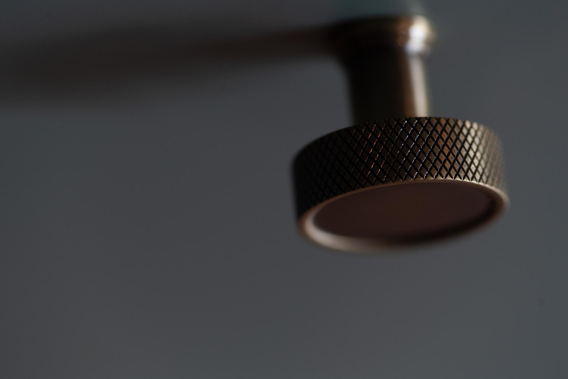
To complete the look, warm brass and beautifully patinated metal finishes are very much in vogue. Cabinet handles, knobs and taps in complementary brass tones bring a welcome touch of warmth and character, working particularly well alongside earthy cabinetry, natural timber and stone surfaces. Together, these finishes create a kitchen that feels considered and contemporary, yet still comfortable, welcoming and timeless.
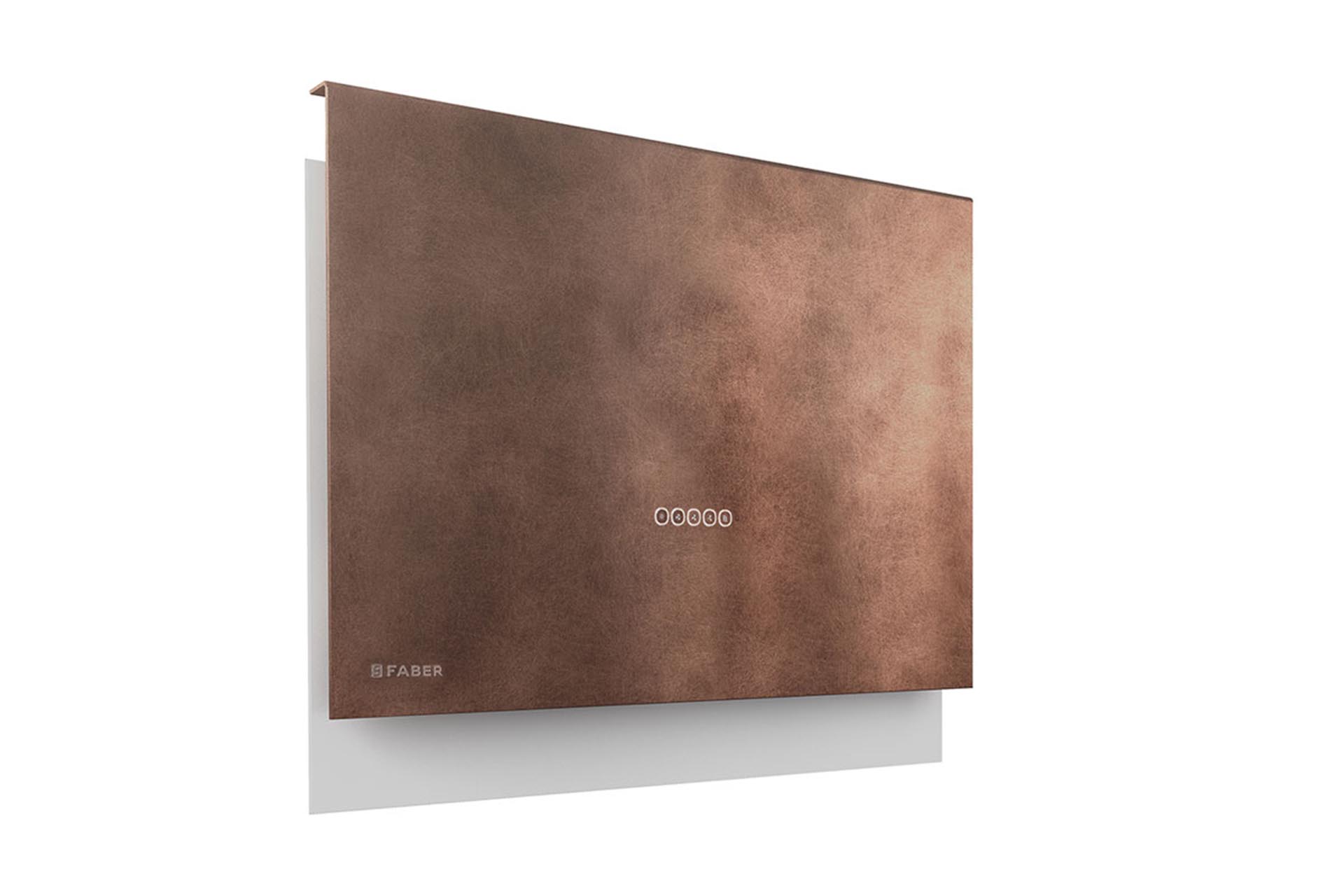
The same revival of brass and copper tones, with “organic” textures to the fore, can be seen in Faber’s recently launched Talìka cooker hood. It is very much state of the-art-technology, rated A for energy efficiency, and yet the copper edition sems to hark back to an older engineering tradition.

Moodboards
Once again we have a few moodboards for you, to help as you build your kitchen vision…
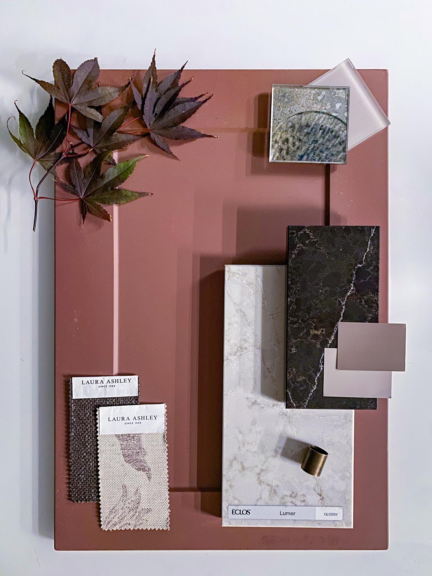
This moodboard brings together the rich, warming colours of autumn, with a rusty-red kitchen door setting the tone for a sophisticated and contemporary palette. Contrasting worktop options include the light Éclos Lumer from Cosentino and the deep, chocolatey tones of Planet Mars by Quartzforms. Both surfaces feature delicate veining that adds depth and visual interest without overwhelming the overall design.
Although these two worktop materials come from different brands, I can see them working beautifully together within the same scheme. Their contrasting colours offer plenty of scope for creative combinations, whether in a kitchen, a home bar, a home office or even a dressing suite. Used together, they provide a lovely balance of light and dark, creating a look that feels both coordinated and full of character.
The moodboard also features Laura Ashley furnishing fabrics in Harley Chestnut Brown and Gosford Wave Dusky Plum Purple, introducing complementary earthy tones and a subtle hint of autumnal colour. The paint shades, Mello Mocha and Rose Bark, reinforce the warm, cocooning feel of the palette.
Completing the scheme are toughened safety glass options from Southern Counties Glass: the Antique Mirror in the Silver Neptune design and Latte in a Satin finish. These bring further texture and interest to the mix, demonstrating how carefully chosen surfaces, fabrics, paint and reflective details can cooperate to create a cohesive and inviting interior.
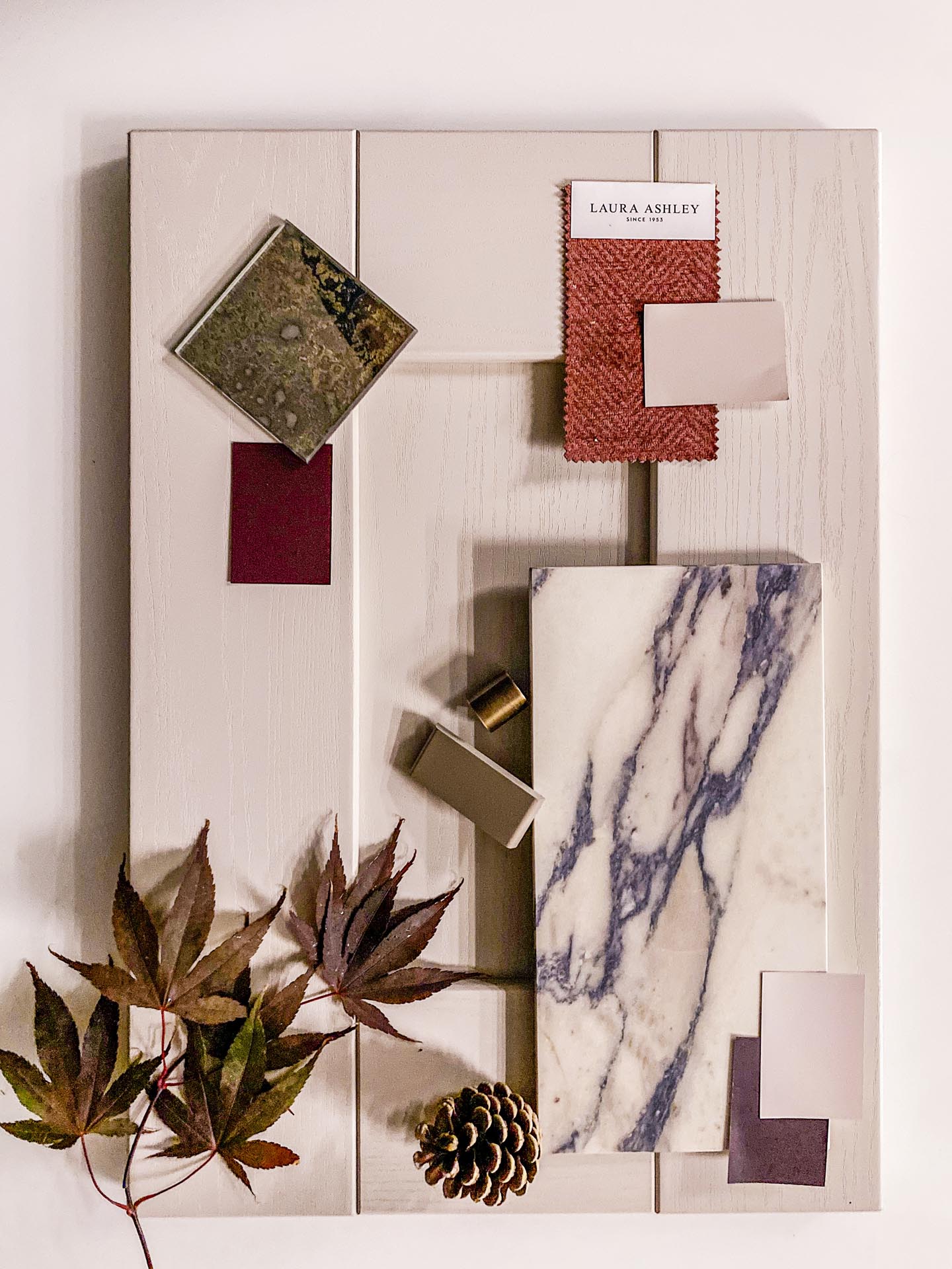
This moodboard combines the timeless elegance of cashmere Shaker cabinetry with the dramatic marbling of Sapienstone 4D Fior di Viola. Calacatta Viola-style marbles are hugely sought-after at the moment, and numerous engineered stone surfaces aim to recreate their distinctive appearance. However, Sapienstone 4D Fior di Viola is one of the most convincing interpretations, with its delicate purple tones and warm, off-white background giving it a particularly natural and sophisticated look.
Beyond its striking appearance, this surface has practical advantages, too. It requires very little maintenance, making it an appealing choice for those who want dramatic marble-inspired styling without the upkeep associated with natural marble. Furthermore, being a ceramic as opposed to an engineered stone / quartz with a resin element, it offers excellent heat resistance.
Completing the scheme is toughened safety glass in the Antique Mirror Silver Neptune design, adding a reflective element and a touch of glamour. Laura Ashley’s sumptuous Edwin Chenille in Burgundy Red introduces a rich, luxurious accent, complementing the purple veining and bringing warmth and depth to this elegant, contemporary palette.
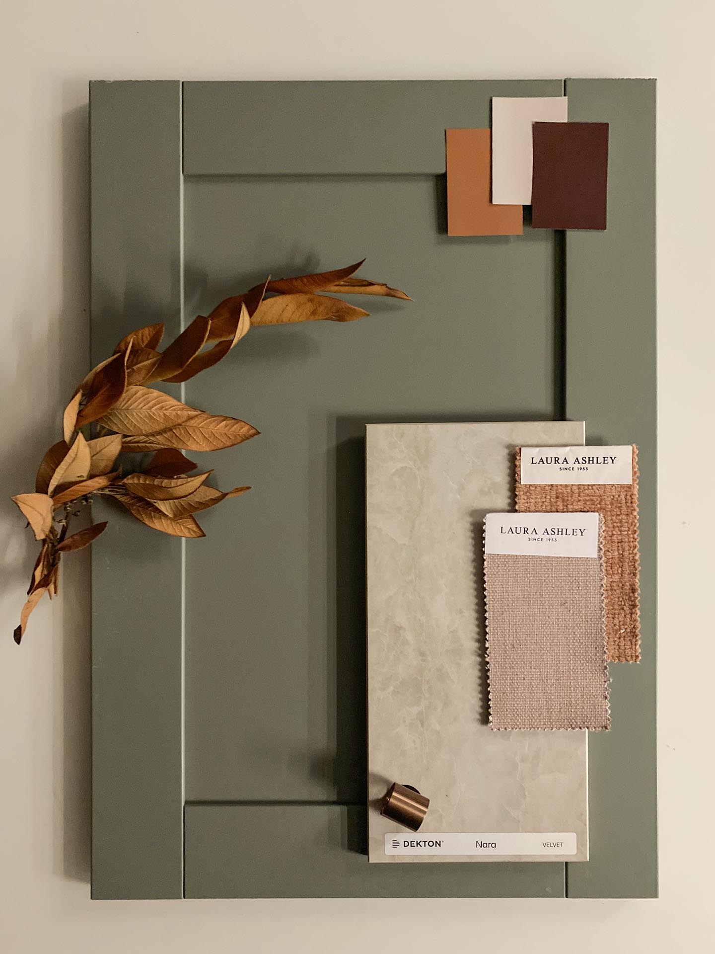
For this moodboard, I wanted to create a softer, more understated autumnal feel, built around a calming sage-green kitchen door paired with the beautiful Dekton Nara. With its elegant Taj Mahal-inspired appearance and subtle pink undertones, Nara brings warmth and natural sophistication to the scheme without overpowering the gentler colour palette.
Taj Mahal is THE name to conjure with at the moment in kitchen worktops. The real stone is a stunning quartzite, as expensive as it is hard to cut and work with. Everyone is in the business of making copies though, from economical engineered stones through Cosentino’s Éclos Tajnar to high end ceramiocs like this Dekton.
The Laura Ashley weaves in Willoughby Dusky Pink and Nanmor Rust Orange introduce complementary shades of muted pink and earthy orange, adding texture and seasonal character. The Dulux paint colours Cinnamon Sprinkle, Mellow Mocha and Cherry Chocolate complete the look, bringing together warm, comforting tones that sit beautifully alongside the sage green and delicate blush hues. The result is a harmonious autumnal palette that feels welcoming, refined and effortlessly stylish.
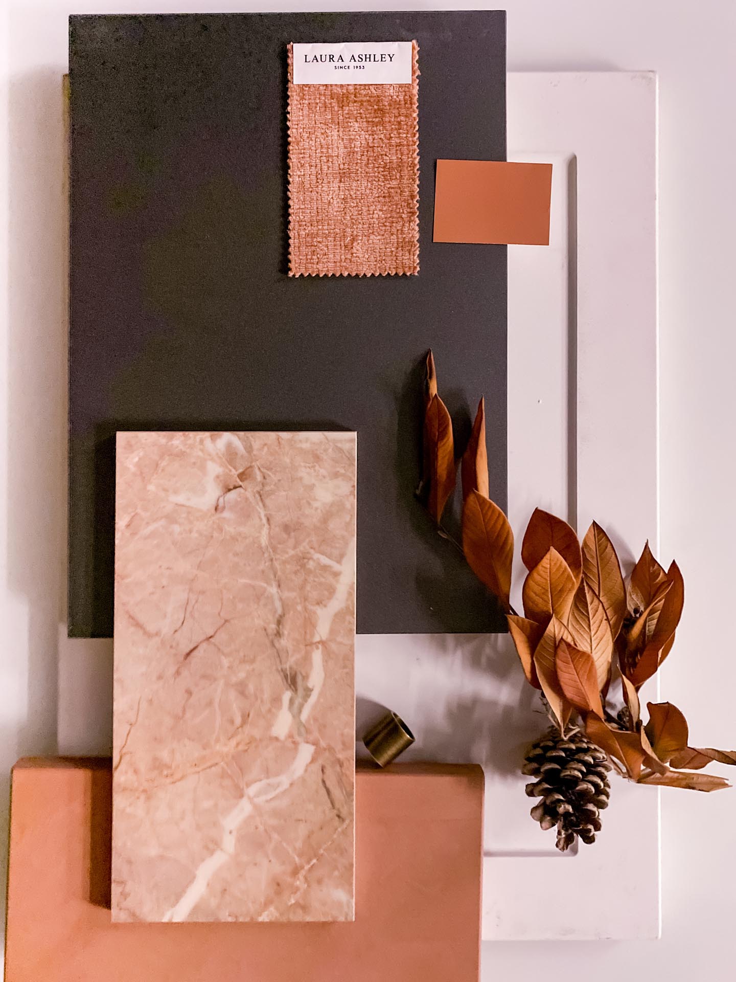
To finish, I wanted to go bolder and hotter with this final autumnal moodboard! I love the dramatic, contemporary feel of this combination, where the rich, vibrant tones of Dekton Umber by Cosentino meet Breccia Rosa 4D by Sapienstone. Together, they capture the warmth and intensity of an Indian summer day, with a confident mix of earthy depth and rosy colour.
Once again, I’m not sure whether the manufacturers involved would ordinarily choose to see their products promoted together, but that is one of the pleasures of being a strictly independent fabricator. We can boldly bring together combinations that perhaps no interior designer has brought together before!
The cabinetry combines an off-white, modern Shaker door with a Graphite metallic-finish slab door, adding contrast through both colour and texture. The small tap sample is Quooker’s Patinated Brass finish. Quooker is a market leader in the boiling-water tap sector, and an increasing number of our very best stone worktop installations now incorporate one of these practical, stylish taps.
The fabric from Laura Ashley nods towards an Autumn in North Wales: Nantmor Rust Orange. For the final finishing touch, the Dulux paint shade Cinnamon Sprinkle brings warmth and cohesion to the scheme, although Sunset Kiss or Spiced Honey, also from Dulux, would work equally well. The result is a bold, contemporary palette that embraces autumn’s warmer side with confidence and character.
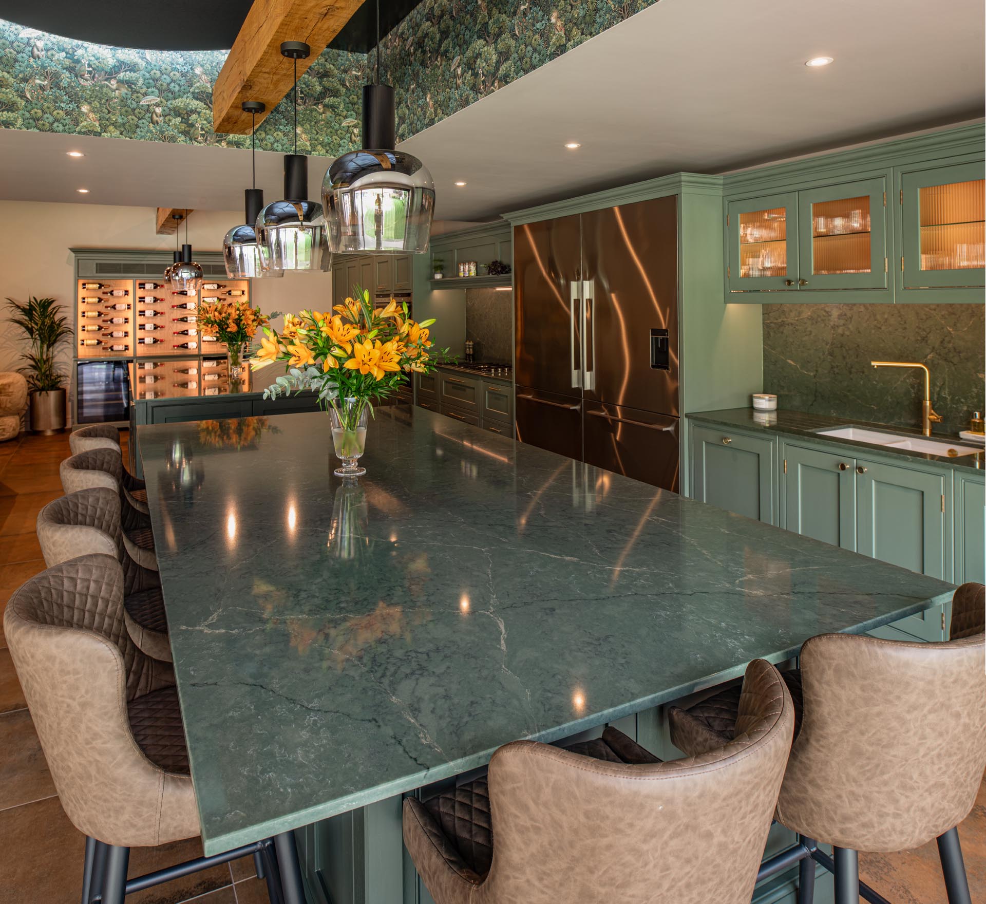
An immense and stunning kitchen which we photographed recently in Burstow, Surrey. Watch out for the forthcoming case study!
Autumn is the perfect time to rethink your interior colour palette, whether you’re planning a few seasonal updates or embarking on a complete kitchen renovation. From soft sage greens, dusky pinks and warm taupes to rich rusty reds, chocolate browns and dramatic marble-inspired surfaces, this season offers plenty of inspiration for creating a kitchen with warmth, character and individuality.
Our autumnal moodboards bring together beautiful worktop materials from leading manufacturers, complemented by cabinetry, fabrics, paint colours, metallic finishes and carefully chosen accessories. From understated elegance to bold, contemporary contrasts, they demonstrate how different colours and textures can work together to create something genuinely distinctive. As an independent stone fabricator, we love exploring combinations beyond the usual showroom pairings, helping you discover possibilities you might not have considered.
Whether you’re drawn to the timeless appeal of quartz, the natural character of granite or the dramatic styling of modern ceramic and sintered stone surfaces, the right worktop can transform the entire feel of your kitchen.
Looking for inspiration for your own kitchen? At AG Stoneworks, we’re always happy to talk through the options, help you compare materials and find a worktop that suits your lifestyle and budget.
Call us on 01293 204022 or email sales@agstoneworks.co.uk for friendly, straightforward advice and discover how we can help bring your kitchen ideas to life.
Images from retailers mentioned, from AG Stoneworks and Andrew King Photography.
